
10 Common Mistakes to Avoid When Photographing Your Artwork
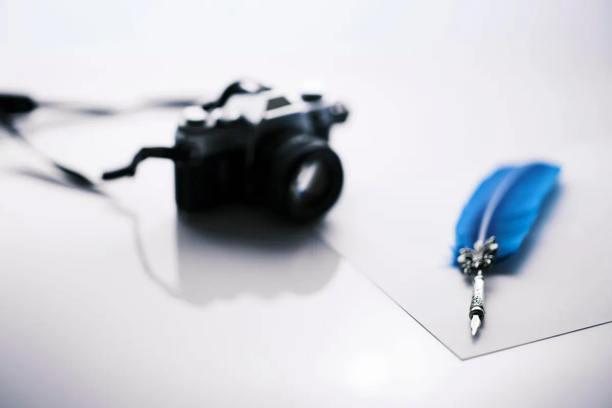
You spent three weeks on a piece, then photographed it in ninety seconds on the kitchen counter with the ceiling light on. That photo is now the version a gallery, a client, or a stranger scrolling at midnight will judge. Most artwork photography problems have nothing to do with expensive gear. They come from a handful of repeatable mistakes, and nearly all of them are fixable in a single afternoon.
1. Mixing two kinds of light in one frame
This is the most common problem, and the hardest to repair later. A window on the left and a tungsten bulb overhead give you two different colour temperatures across the same surface. The result is a warm patch down one side and a cool blue cast on the other. Editing can nudge it, but it can rarely fix two casts pulling in opposite directions.
The fix is simple: choose one source and switch off the rest. Turn off the ceiling lights, close the blinds or shoot after dark, then work with a single window or two matched lamps. Diffuse that light with a sheet of tracing paper, parchment, or a white shower curtain held between the light and the work. A diffused source at roughly 45 degrees to the surface keeps colour even while still showing the texture of brushwork or canvas weave.
Test the light before you commit
Photograph a plain sheet of white paper in your setup. If it reads white on screen, your light is neutral. If it reads cream or grey-blue, change something before you shoot the art.
2. Tilted camera, wide lens, wrong distance
Shooting flat work at an angle creates keystone distortion: square corners turn into trapezoids, and no amount of cropping makes it look right. Phone cameras make this worse because their wide lenses bend lines at close range, and people tend to stand too near to fill the frame.
- Back up and zoom in with an optical zoom rather than walking closer. Less distortion, flatter lines.
- Keep the camera parallel to the surface — not just pointed at it. Check the top and bottom edges of the work against the edges of your screen.
- Fill about 80% of the frame. A little margin gives you room to straighten and crop without cutting into the piece.
- Skip the perspective slider unless you have to use it. It stretches pixels and softens detail, especially in a corner of dense pattern.
For work with real depth — a sculpture, a thickly painted canvas, a ceramic piece — one straight-on shot plus two or three angled detail shots will communicate far more than a single clever angle ever will.
3. Letting the edges and background run wild
Look at the four corners of your frame before you press the shutter. Cords, the foot of an easel, a coffee cup, a roll of tape, your own shadow across one side — all of it reads as carelessness, even when the artwork itself is excellent. A sheet of grey or black card behind the work, or a clean wall, solves most of it.
Dust and fingerprints matter more than you expect. A soft brush over the surface and a wipe of the lens take ten seconds and save an hour in editing. Never crop so tightly that the artwork touches the edge of the image; a sliver of background makes the piece read as an object rather than a shape floating in a white page.
4. Ignoring white balance and colour accuracy
Auto white balance drifts between frames, and it drifts most when you change your position or the light shifts. Include a grey card or a plain white sheet in one frame of each setup, then use it to set a custom white balance or as a reference point when you edit. Every image in that session can then be corrected against the same target.
Screens lie. Compare your edited file against the physical piece, then check it on a second device — a phone and a laptop, for instance. If the colour looks close to the real thing on both, you are done. Chasing perfection across every screen is a losing game; trust the object, not the display.
5. Over-editing until the work looks like someone else's
The fastest way to make a portfolio look amateur is to push the sliders. Saturation boosted to make colours "pop" turns a considered red into neon orange. Heavy clarity and texture settings add pale halos along every edge. Crushed blacks flatten the detail you worked to build into shadow. All three together produce an image that no longer resembles the piece on the wall.
Keep your edits in this order and stop early:
- Crop and straighten.
- Correct exposure and white balance.
- Apply light contrast — a few points, not twenty.
- Resize first, then sharpen gently.
- Save as a copy. Leave the original file untouched.
6. Wrong file size, colour space and naming
Save a master file at full resolution and keep it separate from the web version. For most portfolio sites, 1500 to 2000 pixels on the long side is plenty; export as a high-quality JPEG in the sRGB colour space, since other profiles can shift or dull on the web. Name files so you can find them in a year: title-medium-size-year.jpg beats IMG_4821.jpg every time. Keep at least one backup somewhere other than the machine you shoot with.
7. Photographing one great image instead of a consistent set
A portfolio is read as a collection, and inconsistency is the quiet killer. If one piece sits on a grey wall, the next on a wooden table, and the third is cropped tightly to the canvas edge, the group looks improvised. Use the same background, the same distance, and the same light for every piece, then crop them all to a similar ratio. Add a detail shot for texture and one image that shows scale — held in a hand or hung in a room — and the set feels considered rather than accidental.
A short routine that prevents nearly all of this
Before you shoot, spend five minutes on setup: choose one light source and switch off the others, tape the work to a wall or stand it on an easel against a neutral background, and rest the camera on something stable with a two-second timer. Centre the piece, leave a border, check the corners, the dust, and any glare.
Then shoot a white reference, the full view, and two or three details. Edit lightly, export an sRGB web copy, and store the master. That is the whole process. The distance between good work and work that looks good online is usually about twenty minutes of attention.
Photo: Engin Akyurt / Pexels